

Interior Design Branding: Why Your Brand Is More Than a Logo, and How Materials, Furniture and Light Speak for It
Interior Design Branding: Your Brand Is More Than a Logo
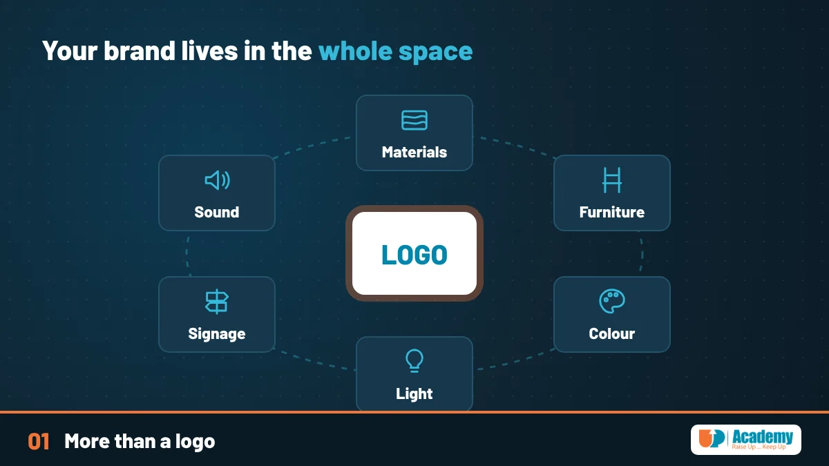
Ask ten business owners what their brand is and most will point at the logo. The logo matters, but it is only the signature at the bottom of a much longer letter. Interior design branding is the practice of making the physical space, its materials, furniture, colours, light, signs and even its sound, say the same thing the logo says. When a customer walks into your shop, clinic, café or office, they are standing inside your brand, not looking at it.
So the honest answer to the question “is interior design part of branding?” is yes, and often the biggest part. A person sees your logo for a second on a screen, but they may spend an hour in your space. If the logo promises something young and playful and the room feels like a government office, people believe the room. The space wins every argument with the logo, because it is the experience they actually lived.
This is also why an interior designer who ignores the brand guidelines is designing a beautiful room for nobody in particular, and a graphic designer who stops at the logo has left the brand half finished. In this article we connect the two fields, using the way we teach both in our interior design courses and our graphic design courses.
Key takeaways
- Interior design is part of branding. A brand is everything people experience, and the space is the one touchpoint they physically walk into and stay inside.
- Start from the brand strategy, not the mood board. Audience, personality, values and price position decide the design before any material is chosen.
- Materials carry meaning. The same coffee shop built in plywood, neon and concrete speaks to students; built in walnut, marble and brass it speaks to executives in suits.
- Graphic design and interior design meet on the walls. Signage, wayfinding, wall graphics, menus and uniforms translate the visual identity into the space.
- Below you will find a method, two side-by-side briefs, sector examples, a reference table, common mistakes, a checklist and six FAQs.
In this article
- Interior Design Branding: Your Brand Is More Than a Logo
- What a Brand Really Is: Logo, Visual Identity and Brand
- Where Interior Design Sits Among Brand Touchpoints
- The Space as a Brand Experience: Third Places and the Experience Economy
- Start From Brand Strategy: Turning Brand Personality Into Design Decisions
- The Brand Language of Materials: What Wood, Concrete, Marble and Brass Say
- Young Audience vs Formal Audience: Same Brief, Different Materials
- Furniture as Brand Behaviour: How Seating Decides How People Act
- Brand Colours in Interior Design: From the Palette to the Room
- Lighting and Colour Temperature: Light Is Part of the Brand
- Where Graphic Design Meets Interior Design: Signage, Wayfinding and Wall Graphics
- Typography in Space: Bilingual Arabic and English Signage
- Beyond Sight: Sound, Scent, Touch and Ceiling Height
- Layout and the Customer Journey: Designing the Brand Story in Plan
- Brand Consistency Across Branches Without Copy and Paste
- Interior Design Branding by Sector: Retail, Cafés, Offices, Clinics and Schools
- How Interior Designers and Graphic Designers Work Together
- Common Interior Design Branding Mistakes
- Interior Design Branding Checklist
- Interior Design Branding: Frequently Asked Questions
What a Brand Really Is: Logo, Visual Identity and Brand
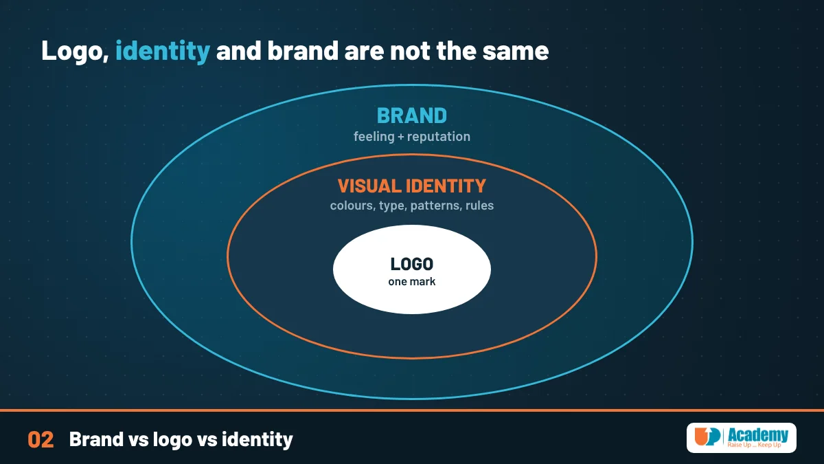
It helps to separate three words people use as if they were the same. The logo is a single mark: a symbol, a wordmark or both. The visual identity is the whole system around it: colours, typefaces, photography style, patterns, icons and the rules for using them. Marty Neumeier, in his Dictionary of Brand (2004), describes brand identity as the expression of a brand, including its name, trademark, communications and visual appearance.
The brand itself is bigger again. It is the reputation and the feeling that forms in people’s minds from every contact they have with you: the product, the price, the way staff answer the phone, the packaging, the website and the place. You design the identity; the public decides the brand. Your job is to make every contact point push that feeling in the same direction.
Seen this way, interior design is simply the identity system applied in three dimensions. The colour palette becomes paint, tiles and upholstery. The typeface becomes signs and door numbers. The brand’s tone of voice becomes the choice between a long communal table and private leather booths. If you are studying identity design, our Logo and Brand Identity workshop covers the system side; this article covers what happens when that system meets a real room.
Where Interior Design Sits Among Brand Touchpoints
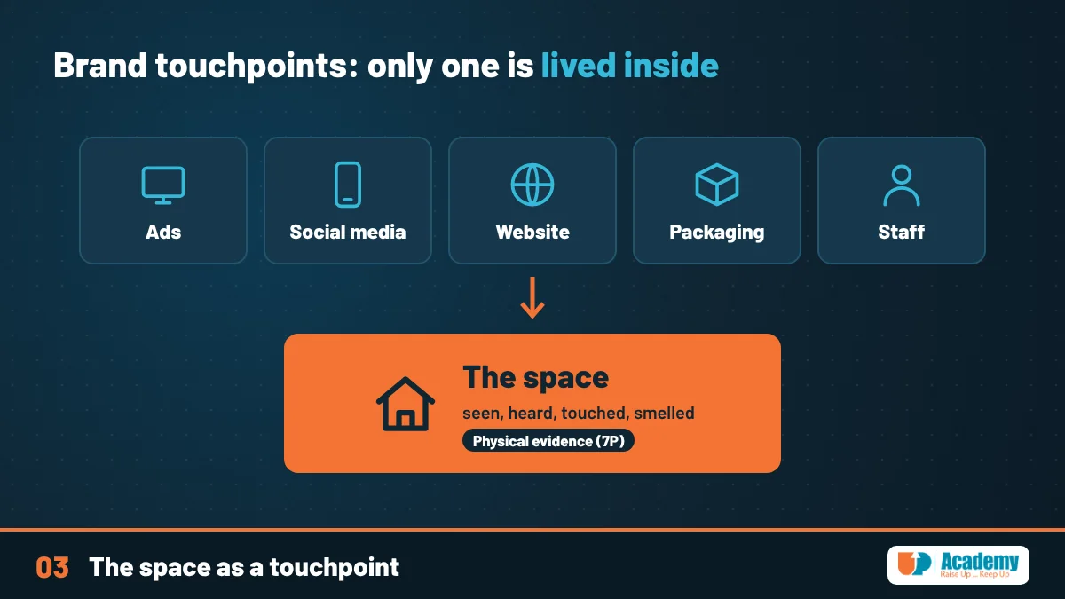
Marketers call every contact between a person and a brand a touchpoint. The list is long: an ad, a social post, the website, the delivery box, the receipt, the staff uniform, the phone call, and the physical space. Most touchpoints are seen. The space is the only one that is entered, walked through, sat in, heard and smelled, and it lasts the longest.
Marketing theory already gave the space a name. When Booms and Bitner extended the classic marketing mix into the seven Ps of services marketing in 1981, they added people, process and physical evidence. Physical evidence is the environment where the service happens and every tangible thing in it. We explain the full mix in our article on the history of marketing and the 7P marketing mix; for an interior designer, “physical evidence” is literally the job description.
The practical lesson is to design the space as one touchpoint in a chain, not as an island. The colour on the shop front should match the Instagram grid; the font on the menu should match the website; the feeling of the waiting area should match the tone of the booking messages. When one link breaks, customers notice the gap even if they cannot name it.
The Space as a Brand Experience: Third Places and the Experience Economy
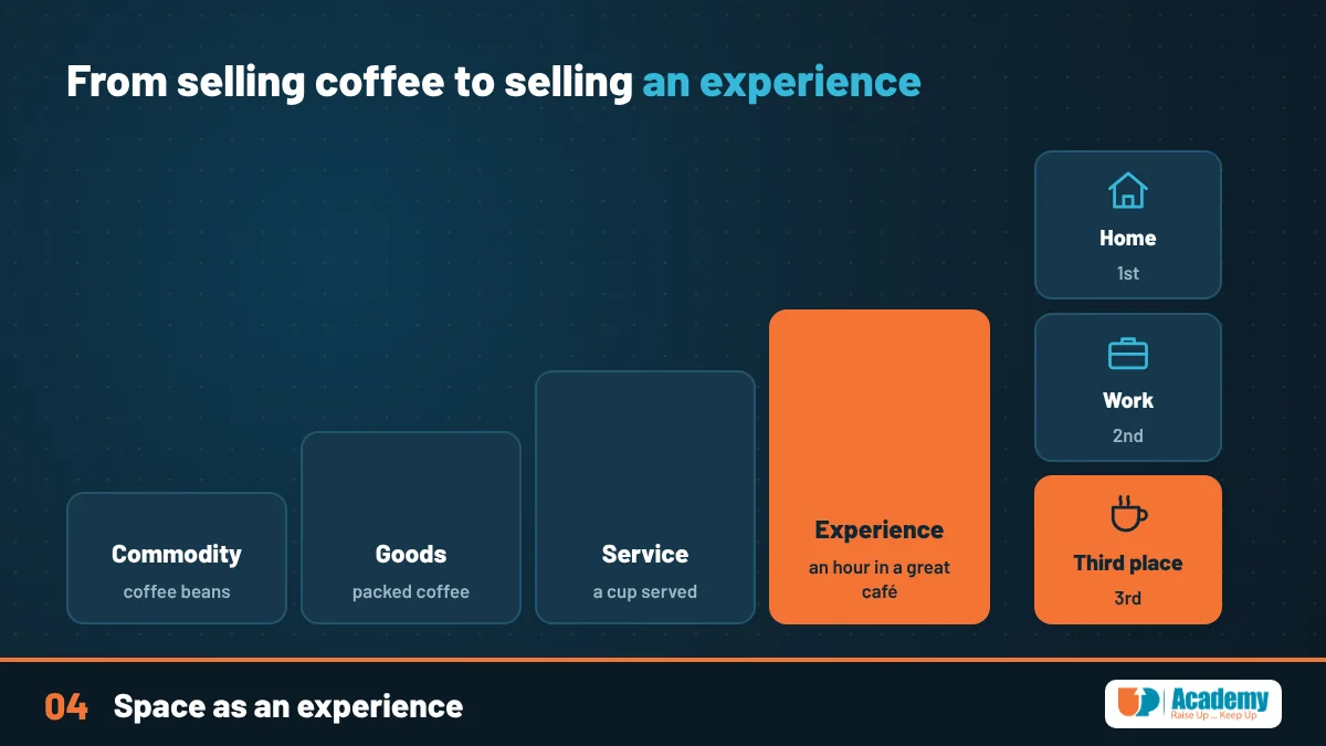
Two ideas explain why companies spend so much on their interiors. The first is the third place. Sociologist Ray Oldenburg, in his 1989 book The Great Good Place, described third places as the informal spaces between home (the first place) and work (the second), such as cafés, barbershops and bookstores, where community life happens. Coffee chains built entire brands on being that place, so the sofa, the plug socket and the background music became part of the product.
The second idea is the experience economy. In a 1998 Harvard Business Review article, followed by a 1999 book, B. Joseph Pine II and James H. Gilmore argued that after commodities, goods and services, businesses increasingly sell memorable experiences. A cup of coffee is a commodity; the hour you spend in a well designed café is an experience, and people pay more for it.
For a designer, both ideas lead to the same brief: the space is not packaging around the product, it is part of what the customer buys. That changes the questions you ask. Not only “what looks good?” but “how long should people stay?”, “should they come alone or in groups?” and “what should they remember and tell their friends?”.
Start From Brand Strategy: Turning Brand Personality Into Design Decisions
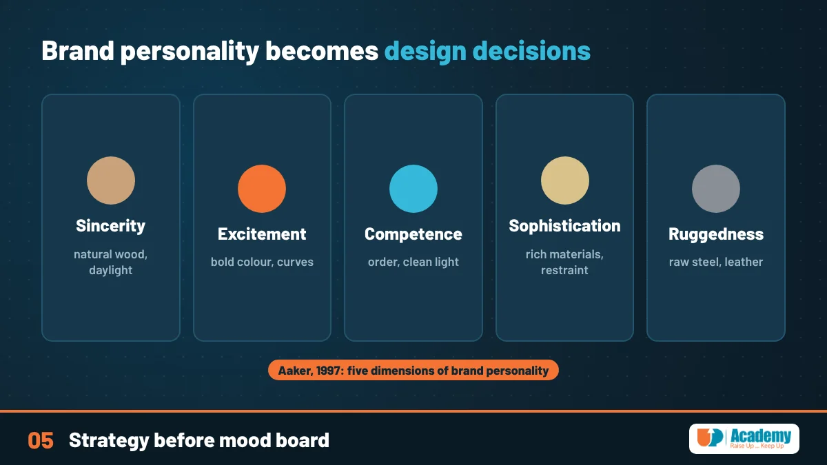
Good interior design branding starts with a brief, not a Pinterest board. Before choosing any finish, collect four things from the brand: the audience (age, income, lifestyle, why they come), the personality (three to five adjectives), the values (what the brand will never compromise on) and the price position (budget, mid-market or premium). If the client has a brand guidelines document, read it first; if not, write a one-page version together.
A useful tool for the personality step comes from psychologist Jennifer Aaker, whose 1997 study Dimensions of Brand Personality grouped brand traits into five dimensions: sincerity, excitement, competence, sophistication and ruggedness. Each dimension suggests a different room. Sincerity leans to natural wood, daylight and handmade objects; excitement to bold colour and unexpected shapes; competence to order, clean lines and good light; sophistication to rich materials and restraint; ruggedness to raw steel, leather and exposed structure.
Then translate every adjective into a decision you can draw. “Welcoming” might become a low reception desk with no glass barrier. “Precise” might become a strict ceiling grid and aligned joinery. “Playful” might become one curved wall and a bright accent colour. If an adjective cannot be turned into a drawing, it is not yet a design brief.
The Brand Language of Materials: What Wood, Concrete, Marble and Brass Say
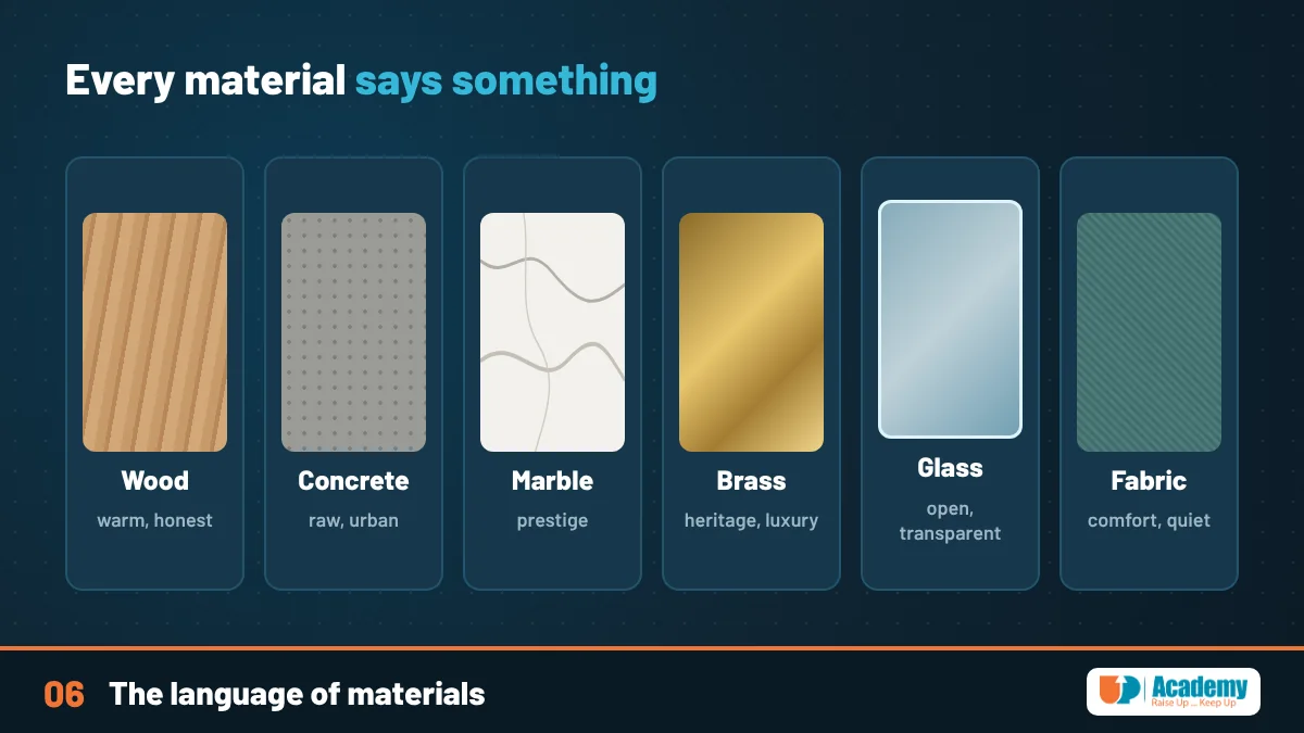
Every material arrives with a meaning that people read in a second. Natural wood says warmth and honesty; light oak and plywood feel young and relaxed, while dark walnut feels established. Exposed concrete says raw, urban and confident. Marble and stone say permanence and prestige. Brass and bronze say heritage and luxury. Glass says transparency and openness; fabric, wool and velvet say comfort and quiet.
Finish matters as much as the material. The same steel reads as industrial when it is raw and welded, as technical when it is brushed, and as playful when it is powder-coated in a bright colour. A matt surface feels calm and modern; a high gloss feels glamorous, or cheap if it is used everywhere. Touch counts too: people judge quality through their hands on a counter, a door handle or a chair arm.
This is the heart of what interior designers and brand designers share. When you build a material board, treat it like a colour palette: one or two hero materials that carry the personality, one or two supporting materials, and a neutral base. In our Interior Design Fundamentals course students build material boards before they model anything, because the board is where the brand becomes physical.
Young Audience vs Formal Audience: Same Brief, Different Materials
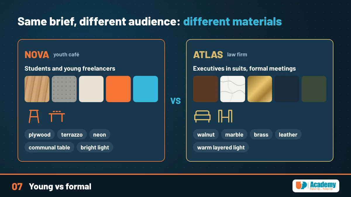
Here is the point many clients miss: the audience changes the materials, not just the colours. Imagine two fictional brands with the same floor area. NOVA is a coffee and co-working space for university students and young freelancers. ATLAS is a law and consulting firm whose clients arrive in suits for serious meetings. Both want a reception, a seating area and a meeting room.
For NOVA we would choose light plywood, exposed concrete, terrazzo, perforated metal and colourful laminates, with stackable chairs, high stools, beanbags and a long communal table full of sockets. Lighting is bright with a few playful neon or LED accents, the palette uses the brand’s energetic colours in bold blocks, and the walls carry large graphics and quotes. Everything says: come in, plug in, stay, bring friends, post a photo.
For ATLAS we would choose dark walnut, natural stone or marble, brushed brass, leather and wool carpet, with upholstered armchairs, a solid boardroom table and acoustic panels that keep conversations private. Lighting is warm and layered, the palette is deep navy, charcoal or green with one metallic accent, and graphics are limited to a refined logo and discreet signage. Everything says: you are in safe, experienced hands. Neither space is “better”; each one is right for its audience, and swapping them would damage both brands.
Furniture as Brand Behaviour: How Seating Decides How People Act
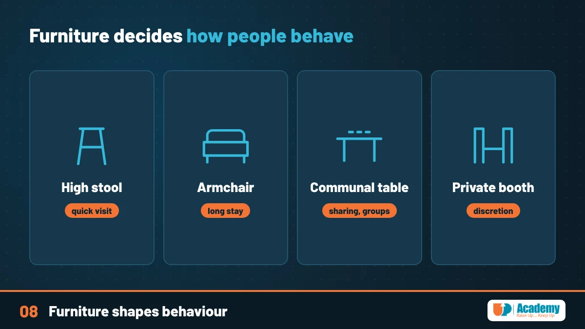
Furniture is where a brand’s promise turns into behaviour. A high stool at a window bar invites a quick visit; a deep armchair invites a long stay; a communal table invites strangers to share; a private booth promises discretion. Fast-food brands have long used firmer, more upright seating to keep tables turning, while lounges use soft, low seating to slow people down. The furniture plan is, in effect, the brand’s business model drawn in plan.
Scale and proportion also speak. Oversized pieces feel generous and premium; small, dense layouts feel lively and affordable. Rounded edges feel friendly and safe, which is why they suit children’s spaces and clinics; sharp, rectilinear forms feel precise and corporate. Even the distance between tables sends a message about privacy and price.
For many brands the most effective move is custom furniture: a reception desk, a display unit or a bench designed around the brand’s shapes and materials instead of chosen from a catalogue. A rounded corner that echoes the logo, a shelf proportion that matches the packaging, a cut-out pattern taken from the brand pattern. We teach this kind of joinery design in our Kitchen, Wardrobe and Custom Furniture Design course.
Brand Colours in Interior Design: From the Palette to the Room
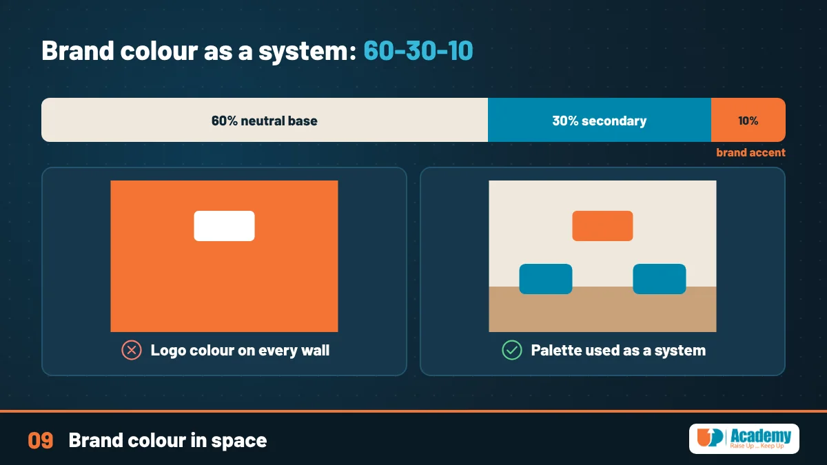
The most common branding mistake in interiors is painting the walls in the logo colour. A colour that looks perfect on a 3 cm logo can be exhausting on a 30 square metre wall. Instead, think of the brand palette as a source, not a paint order. Many designers use the 60-30-10 rule of thumb: about 60% a neutral or brand-friendly base, 30% a secondary colour, and 10% the strongest brand colour as an accent on a feature wall, the counter front, chairs or signage.
Colour also changes how people think and feel. In a 2009 study in Science, Ravi Mehta and Rui (Juliet) Zhu found that red improved performance on detail-oriented tasks while blue improved performance on creative tasks. That does not mean every office should be blue, but it shows that colour choices are functional, not only decorative. A focused service like a pharmacy and a creative studio may need different colour strategies even inside the same brand family.
Remember that interior colour is never seen alone: it sits under real light, next to real materials. Always test brand colours as large physical samples on site, in the morning and the evening, and match them to paint, laminate and fabric codes. The brand guidelines should eventually include an environmental colour page listing those approved codes, just as they list CMYK and RGB values for print and screen.
Lighting and Colour Temperature: Light Is Part of the Brand
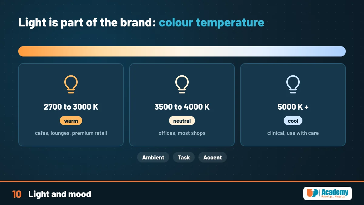
The same room can feel like a cosy restaurant or a hospital corridor depending only on the light. Light is measured in colour temperature, in kelvin (K). Warm white around 2700 to 3000 K is yellowish and intimate, and it suits hospitality, lounges and premium retail. Neutral white around 3500 to 4000 K suits offices and most shops. Cool light above 5000 K looks bluish and clinical, so it should be used carefully, mainly where precision and cleanliness are the message.
Beyond temperature, think in layers: ambient light for the general level, task light where people read, cut or work, and accent light that makes products, artwork or the logo wall stand out. Premium brands usually show more contrast, with pools of light and darker surroundings. Budget and youthful brands often prefer brighter, more even light that feels open and energetic.
Colour quality matters too. A lamp with a high colour rendering index (CRI) shows food, skin, fabric and the brand colours as they really are, while a poor lamp can turn a carefully chosen brand red into a dull brown. When you specify lighting, specify it like a brand asset: temperature, CRI, brightness and where each type goes. Our real-time rendering course with D5 Render and Lumion shows how to test lighting moods with the client before anything is installed.
Where Graphic Design Meets Interior Design: Signage, Wayfinding and Wall Graphics
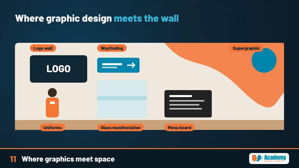
This is the place where the two professions literally share a wall. Environmental graphic design covers every graphic element in a built space: the logo wall at reception, room names, directional signs, door numbers, glass manifestation (the frosted strips on glass doors), wall murals, menu boards, display graphics and even the floor markings. It is a recognised field, with its own professional body, the Society for Experiential Graphic Design (SEGD).
Wayfinding is the most functional part. Urban planner Kevin Lynch introduced the term in his 1960 book The Image of the City, and today wayfinding design means helping people understand where they are and where to go, through signs, colour coding, landmarks and clear routes. A hospital, a university or a mall with good wayfinding feels calm and competent; a confusing one makes the whole brand look disorganised, however beautiful the finishes are.
At the expressive end are supergraphics: large-scale graphics painted across walls, floors and ceilings. Supergraphics emerged in the mid-1960s, with designers such as Barbara Stauffacher Solomon painting bold shapes across interiors at Sea Ranch in California. Today a single brand pattern, enlarged to wall size, can do more for recognition than ten small logos. These are graphic design skills, built with the same tools we teach in Adobe Illustrator and InDesign and print production.
Typography in Space: Bilingual Arabic and English Signage
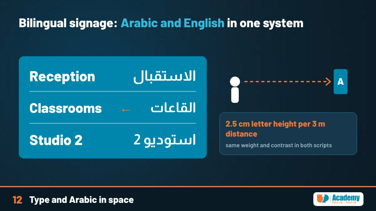
Brand typefaces do not stop at the screen. On a sign, a font must work at a distance, in poor light and at an angle. A practical rule of thumb used by many sign makers is about 2.5 cm of letter height for every 3 metres of viewing distance for comfortable reading, so a sign read from 15 metres needs capitals of roughly 12 cm or more. Test signs at full size on site; a mock-up taped to the wall settles arguments faster than any screen preview.
In Egypt and the Arab world most commercial spaces need bilingual signage, and that is where many brands lose consistency. Choose an Arabic typeface that matches the personality of the Latin one in weight and contrast, and set clear rules: which language comes first, how the two align, and how right-to-left Arabic and left-to-right English share one panel without fighting. Arabic usually needs more line height than Latin text, so give it room.
Arabic also offers something unique to interior branding: calligraphy and geometric pattern as wall art, screens and mashrabiya-inspired partitions. Used thoughtfully, a modern interpretation of an Arabic pattern can give an international brand a local voice without breaking its identity. Used carelessly, it becomes a cliché, so always connect the pattern to the brand’s own shapes and story.
Beyond Sight: Sound, Scent, Touch and Ceiling Height
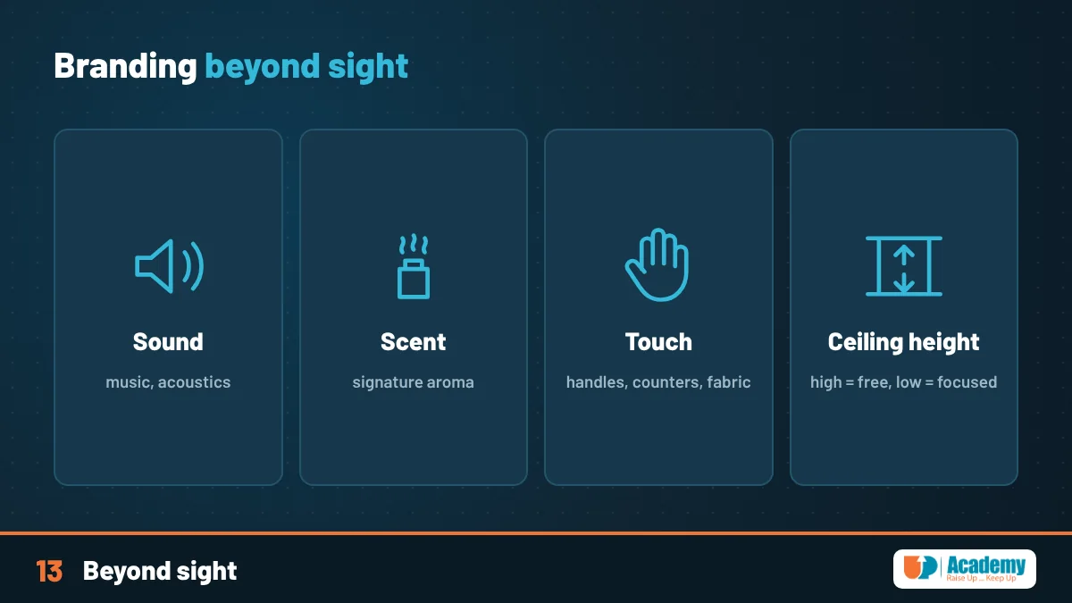
Interior design branding is not only visual. Sensory branding uses all five senses, an idea popularised by Martin Lindstrom’s work in the mid-2000s. In 1990 Singapore Airlines introduced a signature scent, Stefan Floridian Waters, blended into the cabin crew’s perfume and the hot towels, and frequent travellers reported recognising it instantly. Abercrombie and Fitch made its fragrance, Fierce, part of the store itself by spraying it throughout its shops.
Sound works the same way. In a study published in Nature in 1997, Adrian North, David Hargreaves and Jennifer McKendrick showed that the national style of in-store background music shifted which country’s products shoppers chose. For a designer this means acoustics are a brand decision: a lively, echoing space suits a young food hall, while a quiet, absorbent space suits a bank or a clinic. Ceiling panels, carpets and fabric walls are branding tools as much as technical ones.
Even ceiling height affects thinking. Joan Meyers-Levy and Rui (Juliet) Zhu reported in 2007, in the Journal of Consumer Research, that higher ceilings prime more abstract, free thinking and lower ceilings more focused, detailed thinking, a finding known as the cathedral effect. A creative studio and an accounting office may therefore deserve different ceiling treatments, even under one brand.
Layout and the Customer Journey: Designing the Brand Story in Plan
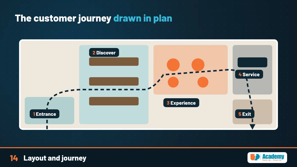
A brand tells its story in order, and so does a plan. Divide the space into zones that follow the customer journey: the threshold where the first impression forms, a discovery zone where products or ideas are shown, an experience zone where people try, sit or talk, the service point, and the exit, which is the last memory people take home. Each zone can carry a different intensity of branding while staying in one language.
Apple is the classic example of a plan that expresses a brand. Its first two stores opened on 19 May 2001 in Tysons Corner, Virginia, and Glendale, California, and the Apple Store concept that followed used long, open tables where products can be touched, few walls and very little visible stock: the same simplicity as the products. The plan itself says “try it, ask us, take your time”.
Layout can also be used too aggressively. The Gruen transfer, named after architect Victor Gruen, designer of Southdale Center, which opened in 1956 as an early indoor mall, describes the moment shoppers lose track of their original goal in a deliberately confusing environment. A brand that values trust should avoid that kind of manipulation. Clear routes, visible exits and honest sightlines are themselves a brand promise.
Brand Consistency Across Branches Without Copy and Paste
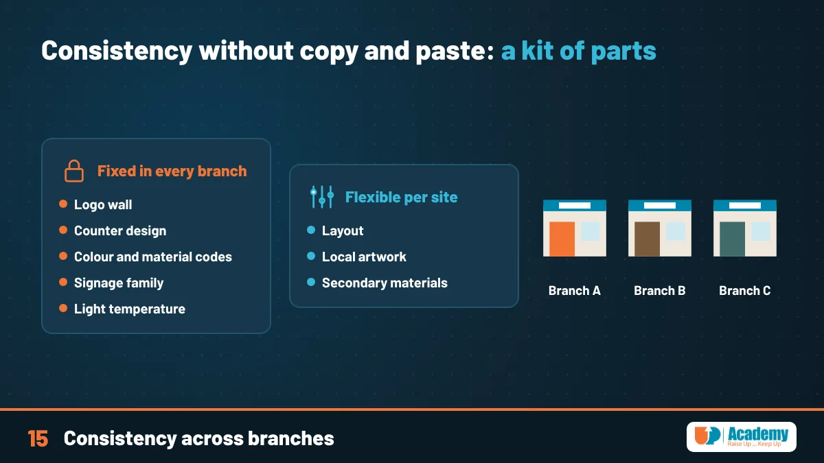
A growing brand faces a real tension: every branch must feel like the same brand, yet copying one interior into every building often fails, because sites differ in size, light and neighbourhood. The professional answer is a kit of parts: a documented set of fixed elements (logo wall, counter design, colour codes, signage family, key materials, light temperature) and flexible elements that adapt to each site (local artwork, layout, secondary materials).
Starbucks is a well documented example. In January 2014, it shifted from a single worldwide look towards locally relevant design for each store, while the core brand elements stayed the same. The lesson for smaller brands is the same: decide what is non-negotiable and write it down, and let the rest breathe.
In practice, this kit lives in an interior brand standards section of the brand guidelines: drawings of the standard counter, approved material and paint codes, lighting specifications, signage templates and photos of correct and incorrect applications. Preparing these documents is shared work between interior and graphic designers, and it is exactly the kind of technical package we cover in Technical Details, BOQ and Site Execution.
Interior Design Branding by Sector: Retail, Cafés, Offices, Clinics and Schools
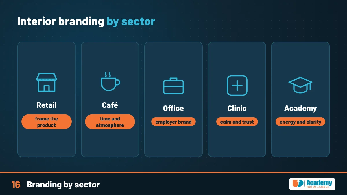
Retail spaces sell, so the brand must frame the product: display systems, lighting on merchandise, a clear route and a memorable façade. Cafés and restaurants sell time and atmosphere, so seating, acoustics, light and the counter carry the brand, along with menus and packaging designed by the graphic team.
In offices, the audience is often the team itself. A workplace interior is part of the employer brand: it tells employees and job candidates what the company values, collaboration or focus, hierarchy or openness. Meeting rooms named after brand values, branded quiet zones and well designed reception areas also shape how visiting clients see the company.
Clinics need calm, trust and clean wayfinding; soft colours, warm but clear light and rounded forms reduce anxiety. Schools and academies need energy and clarity, with flexible furniture and walls that display student work. If you want to see how we present student work, visit our student work gallery. The reference table below sums up these differences.
| Sector | Typical audience | Brand personality | Key materials | Colour and light | Graphics role |
|---|---|---|---|---|---|
| Youth café / co-working | Students, young freelancers | Excitement, sincerity | Plywood, concrete, terrazzo, coloured laminate | Bold accents, bright light, neon details | Large wall graphics, playful signage |
| Law or consulting office | Executives, formal clients | Competence, sophistication | Walnut, marble, brass, leather, wool | Deep tones, warm layered light | Refined logo, discreet signs |
| Retail shop | Shoppers by segment | Depends on brand | Display systems, durable floors | Accent light on products | Façade, displays, wayfinding |
| Clinic | Patients and families | Sincerity, competence | Easy-clean surfaces, soft wood | Soft colours, clear warm-neutral light | Calm wayfinding, room names |
| Academy / school | Learners, parents | Excitement, competence | Robust laminate, pinboards, flexible furniture | Energetic accents, even light | Student work walls, clear signs |
How Interior Designers and Graphic Designers Work Together
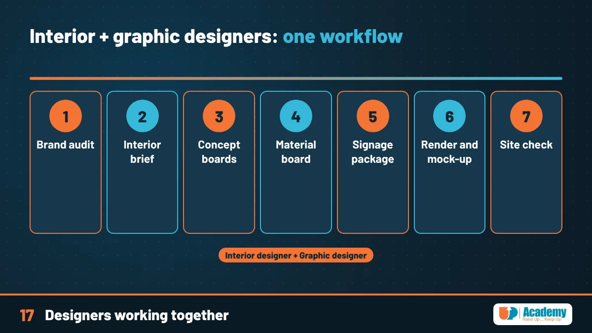
The best branded spaces come from interior and graphic designers working in one process instead of handing files over a wall. A workflow that works in practice has seven steps: 1) brand audit (read the guidelines, visit existing branches, list what works), 2) interior brief (audience, personality, behaviour, budget), 3) concept boards (two or three directions), 4) material and colour board, 5) signage and graphics package, 6) visualisation and mock-ups, and 7) site check before handover.
Each side brings different tools. The interior designer plans space and details in software such as SketchUp and 3ds Max with Corona Renderer, and prepares presentation boards; the graphic designer adapts the identity, draws the sign family, prepares the wall graphics for print and checks the brand rules. When the 3D render shows the real signage and graphics, not grey boxes, the client approves the whole brand experience at once.
From our side as art directors, the brief that most often goes wrong is the one where the graphics are “added later”. By then the wall is too narrow for the logo, the lighting is wrong for the colours and the sign positions clash with the joinery. Bring the graphic designer in at the concept stage. If you are the interior designer, learn enough graphic design to read a brand book; our Design Foundations module and Photoshop for Interior and Architecture course are a good start.
Common Interior Design Branding Mistakes
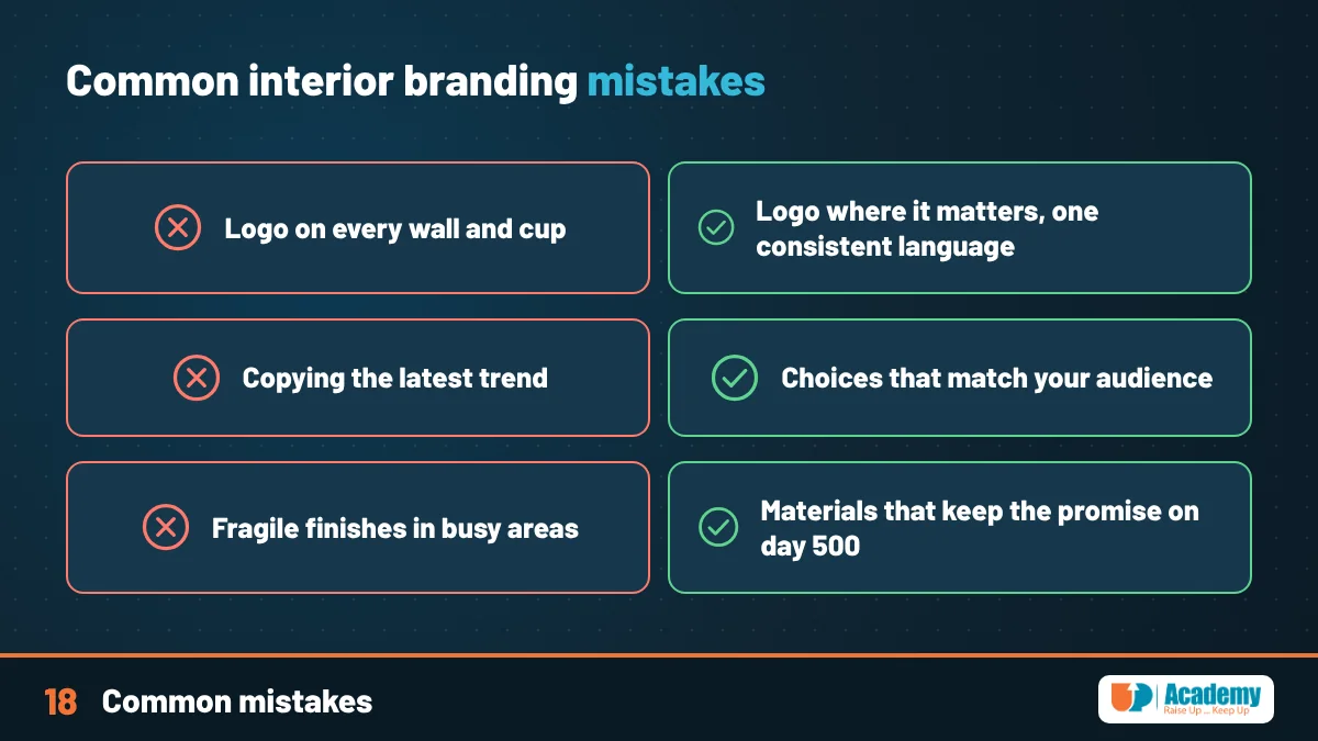
Logo everywhere. Repeating the logo on every wall, cushion and cup does not make a space more branded; it makes it look like a trade-show booth. Recognition comes from a consistent language of materials, colour, shape and light, with the logo placed where it matters: the façade, the reception and the key touchpoints.
Following trends instead of the audience. A fashionable look, such as a particular shade of green or a fluted panel, may be perfect for one brand and wrong for another. If a trend does not match the personality and the audience, it will date quickly and confuse the message. The same goes for copying a famous brand’s interior: you inherit their story, not yours.
Ignoring the budget and maintenance. A white fabric sofa in a busy student café, or a fragile finish in a high-traffic corridor, will look shabby in months, and a shabby space damages the brand more than a simple one. Choose materials that keep the brand promise on day 500, not only on opening day. Finally, forgetting the staff: uniforms, back-of-house areas and staff behaviour must match the front, because people experience the brand through them too.
Interior Design Branding Checklist
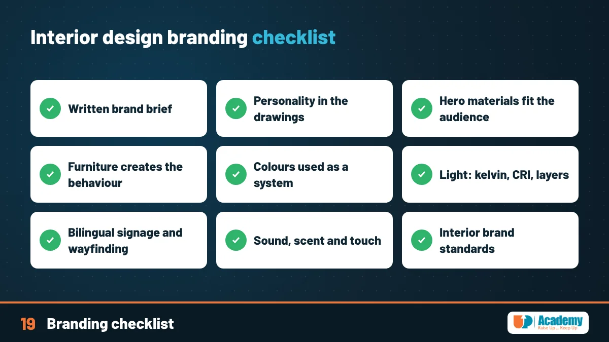
Before you present an interior concept, run through this checklist. Is there a written brand brief with audience, personality, values and price position? Can every personality adjective be pointed to in the drawings? Do the hero materials match the audience, young and casual or formal and established, and will they still look right after a year of use?
Does the furniture plan create the behaviour the brand wants, quick visits or long stays, groups or privacy? Are the brand colours used as a system (base, secondary, accent) rather than painted everywhere, and tested under the real light? Is the lighting specified by colour temperature, CRI and layers?
Is the signage and wayfinding family designed with the brand typefaces, bilingual where needed, and sized for real viewing distances? Have sound, scent and touch been considered? Is there an interior brand standards page so the next branch can be built correctly? If you want to learn to deliver this whole package, explore our Interior Design Diploma and the Master Graphic Design Diploma, or contact us to ask which path fits you.
Interior Design Branding: Frequently Asked Questions
What is interior design branding?
Interior design branding is the practice of designing a physical space so that its materials, furniture, colours, lighting, signage, sound and layout express the same personality and promise as the brand’s logo and visual identity. Instead of decorating a room and adding a logo, the designer starts from the brand strategy and audience, then turns each brand trait into concrete design decisions that customers can see, touch and feel.
Is interior design part of branding?
Yes. A brand is the overall impression people form from every contact with a company, and the physical space is the touchpoint where they spend the most time. Marketing theory even includes it as “physical evidence” in the 7P services marketing mix. If the interior contradicts the logo, people believe the interior, so interior design is one of the most powerful parts of branding, not an extra.
How do materials change with the target audience?
Materials change because each one carries a meaning. For a young audience, designers often use light plywood, exposed concrete, terrazzo, coloured laminates and metal mesh, which feel relaxed and energetic. For a formal audience, such as executives in suits, they use dark walnut, marble or stone, brass, leather and wool, which feel established and premium. The right choice depends on the brand’s personality, not on trends.
How do you apply brand colours to an interior?
Apply brand colours as a system rather than painting every wall in the logo colour. A common rule of thumb is 60-30-10: about 60% neutral base, 30% secondary colour and 10% strongest brand colour as an accent on a feature wall, counter, seating or signage. Test large samples under the real lighting and record approved paint and laminate codes in the brand guidelines.
What is the role of graphic design in interior design?
Graphic design brings the visual identity into the space through environmental graphic design: logo walls, signage, wayfinding systems, door and room names, glass manifestation, wall murals, supergraphics, menu boards and display graphics. The graphic designer adapts typefaces, colours and patterns to real sizes and materials, while the interior designer plans where and how they are built, so the two should work together from the concept stage.
How do you keep brand consistency across several branches?
Keep consistency with a documented kit of parts. Define fixed elements that appear in every branch, such as the logo wall, counter design, colour and material codes, light temperature and signage family, and allow flexible elements that adapt to each site, like layout, local artwork and secondary materials. Record everything in an interior brand standards section of the brand guidelines so every new branch is built correctly.
Written by the UP Academy team, drawing on the art direction experience of our founder, Mahmoud Nasr, in building visual identities and applying them to real spaces.