

Introduction
In graphic design and fine art, understanding how to guide the viewer’s eye is essential. This is where the principle of visual hierarchy comes into play. Visual hierarchy refers to the arrangement and presentation of design elements in a way that clearly shows their order of importance. Whether you’re designing a website, a poster, or a painting, mastering visual hierarchy helps communicate your message effectively and increases viewer engagement.
What Is Visual Hierarchy in Design?
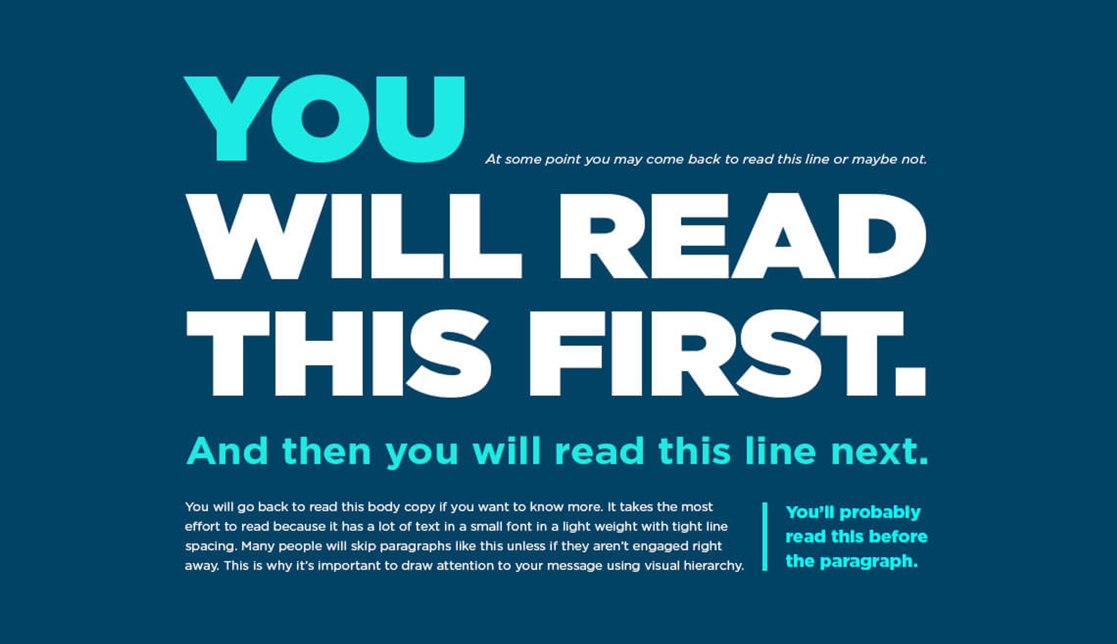
Visual hierarchy is a foundational design principle that involves organizing elements so that viewers can process information in the intended order. It determines what viewers look at first, what they notice next, and how their eyes move across the design.
By manipulating size, color, contrast, alignment, typography, and spacing, designers can influence the flow of attention and ensure the most important messages are seen first.
Why Is Visual Hierarchy Important in Design and Art?
Whether in branding, advertising, UI/UX, or traditional art, visual hierarchy plays a major role in:
- Grabbing attention quickly
- Organizing content for clarity
- Emphasizing key messages or calls to action
- Enhancing the aesthetic quality of the design
Without hierarchy, a design may appear chaotic, confusing, or unprofessional, which can reduce its effectiveness and impact.
Classic Techniques That Support Visual Hierarchy
1. Golden Ratio and Rule of Thirds
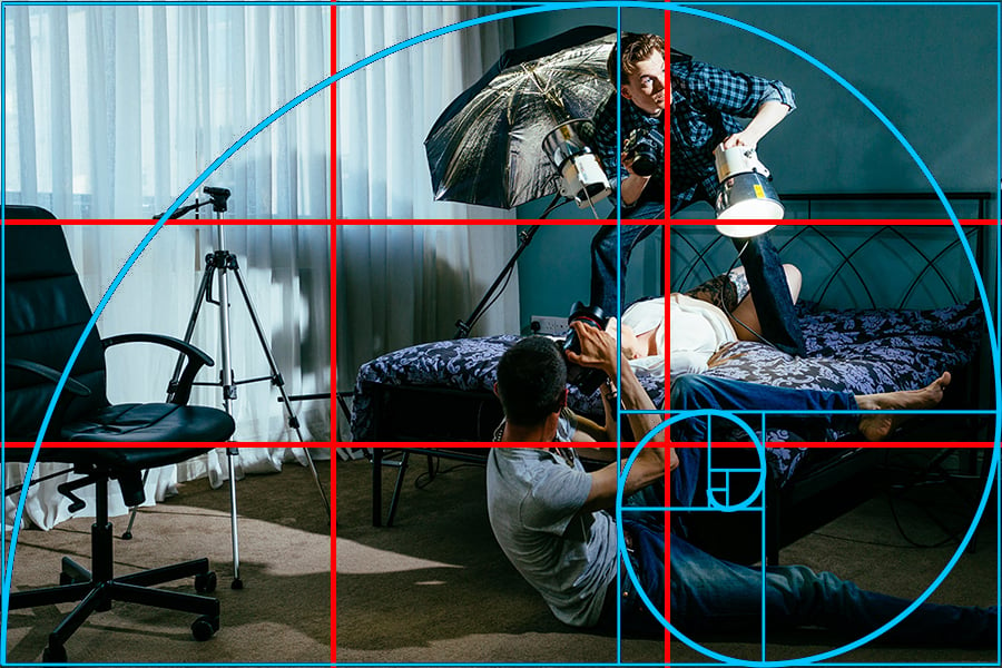
The Golden Ratio (approximately 1.618:1) has been used for centuries to create aesthetically pleasing compositions. Many artists and designers use this ratio to position focal elements in their work.
The Rule of Thirds is a simpler method that divides a canvas into a 3×3 grid. Placing key elements along the lines or intersections helps create balance and draw attention to specific areas.
2. Z-Pattern and F-Pattern Reading Flow
In cultures that read left to right, viewers naturally scan designs in a Z-pattern (for simple designs) or F-pattern (for content-heavy pages). Placing important content along these paths helps ensure it gets noticed first.
Examples of Visual Hierarchy in Design and Art
🎨 The Last Supper by Leonardo da Vinci
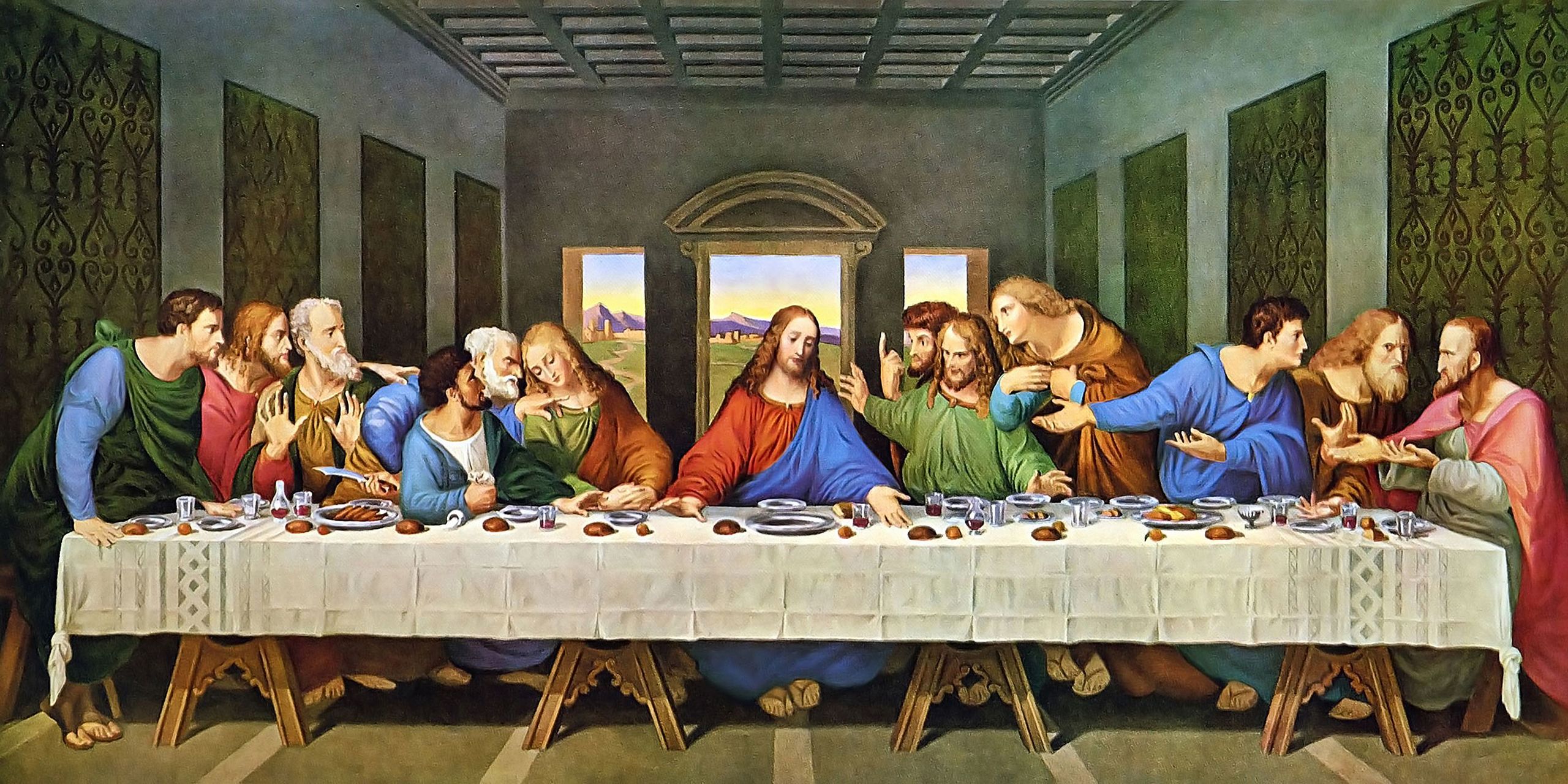
Da Vinci expertly uses perspective and composition to draw attention to Christ at the center. The lines of architecture, grouping of figures, and lighting all lead the viewer’s eye directly to the focal point.
🖼️ Beethoven Poster by Josef Müller-Brockmann

This minimalist Swiss design uses scale and contrast to emphasize the subject (Beethoven). The large, bold type contrasts with smaller, supporting information, creating a clear order of importance.
🖥️ Modern Web UI Design (e.g., Apple, Airbnb)
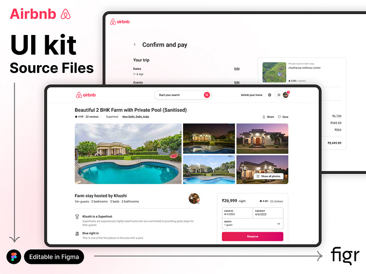
Web pages often feature a bold headline, followed by subtext and a call-to-action button. Typography, white space, and contrast are used to guide the visitor’s journey and improve UX.
How to Apply Visual Hierarchy in Your Designs
Here are practical ways to establish a strong visual hierarchy in your work:
1. Typography
- Use larger fonts for headlines
- Apply bold or different styles to highlight key points
- Pair fonts strategically to create contrast
2. Color and Contrast
- Use high-contrast colors to draw attention
- Apply color psychology to convey mood or urgency
3. Size and Scale
- Bigger elements naturally draw more attention
- Use a scale to show what’s most important
4. Position and Alignment
- Place key elements near the top or along visual paths
- Use alignment grids for balance and consistency
5. Spacing and White Space
- Allow breathing room around important content
- Avoid clutter by grouping related items close together
Common Mistakes to Avoid
- Using too many focal points (leads to confusion)
- Inconsistent typography or spacing
- Ignoring mobile responsiveness in digital design
- Using color without considering contrast or legibility
Conclusion: Let Visual Hierarchy Work for You
Mastering visual hierarchy empowers you to communicate more clearly, whether working in graphic design, painting, or web development. From the precision of Müller-Brockmann’s grids to the dramatic focal points in Da Vinci’s work, hierarchy is the invisible force guiding every viewer’s eye.
Start observing how professional designs and artworks control visual flow, and apply the same principles to your projects.
✅ Keywords Used:
- visual hierarchy
- design principles
- graphic design
- fine art composition
- typography and visual flow
- Rule of thirds in design
- Golden ratio in art
- Examples of visual hierarchy
- Finest 50 100 percent free Revolves No-deposit Extra within the 2025Other Categories
- Wager 100 percent free without DownloadsOther Categories
- Gold-digger Megaways Position Gamble & Added bonusOther Categories
- Gold Coast position because of the Microgaming remark gamble on the web for free!Other Categories
- Gold Currency Frog Slot Favors Informal ParticipantsOther Categories
- fifty Free Spins No-deposit in the 888casinoOther Categories
- Gods from Olympus III Megaways 1×2 Gaming Slot Opinion Trial & Free EnjoyOther Categories
- Zeus compared to Hades Gods from Conflict Slot Play On the webOther Categories
- Pledoo Local casino god out of insane sea local casino Opinion Get an excellent Pledoo More and you can Free RevolvesOther Categories
- 150 Free Spins to your ‘Mask of one’s Wonderful Sphinx’ in the Extra BlitzOther Categories
- Finest 50 100 percent free Revolves No-deposit Extra within the 2025Other Categories
- Wager 100 percent free without DownloadsOther Categories
- Gold-digger Megaways Position Gamble & Added bonusOther Categories
- Gold Coast position because of the Microgaming remark gamble on the web for free!Other Categories
- Gold Currency Frog Slot Favors Informal ParticipantsOther Categories


Course Reviews
- Backend Development
5
Thank You very much for your effort with us